


Project overview
Redesign of digital signage displays so that the content was more engaging and easier to digest. The displays were located in the coffee areas of the office and showed information such as news slides, the weather forecast and items for sale.
I completed the project during July-August 2016.
The Challenge
The coffee areas were being refurbished and larger displays were being installed, so the business objective was to make sure the content displayed correctly on the new screens. The design also needed to be refreshed in line with the new look and feel of the coffee areas.
There were limits around what was technically possible with the displays, and due to time constraints this project was focused on refining the existing solution, but I saw this as a good opportunity to make some improvements.
The Approach
User Interviews
I chatted to a few people in the coffee areas to understand more about how they were actually using the displays.
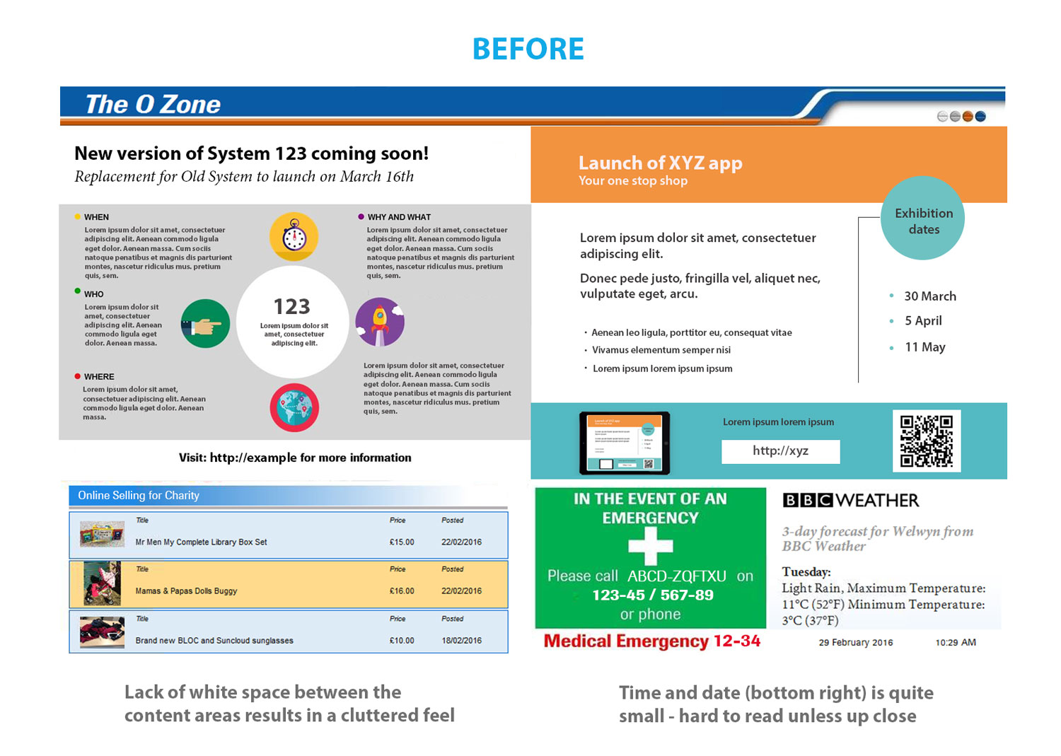
I found that people were mainly scanning the news slides and items for sale while making a coffee. The general feedback was that the existing displays looked quite cluttered and the text on the news slides was hard to read as it was fairly small and fuzzy.
Also some people used the screen to check the time as they were often on their way to a meeting, but the feedback was that it was quite small and hard to read.
Stakeholder Interviews
I met with the communications team to find out what their requirements were, and if they felt any improvements could be made. They asked if it could be made easier for them to add the ‘news slides’ which showed business information and announcements, as they often had trouble getting the sizes right.
Insights
The research with users and stakeholders provided the following insights:
- Users often had trouble reading the slides
- Users used the display to check the time but it was quite small
- Stakeholders found it hard to update the news slides
This is how the screens looked before:
Sketches
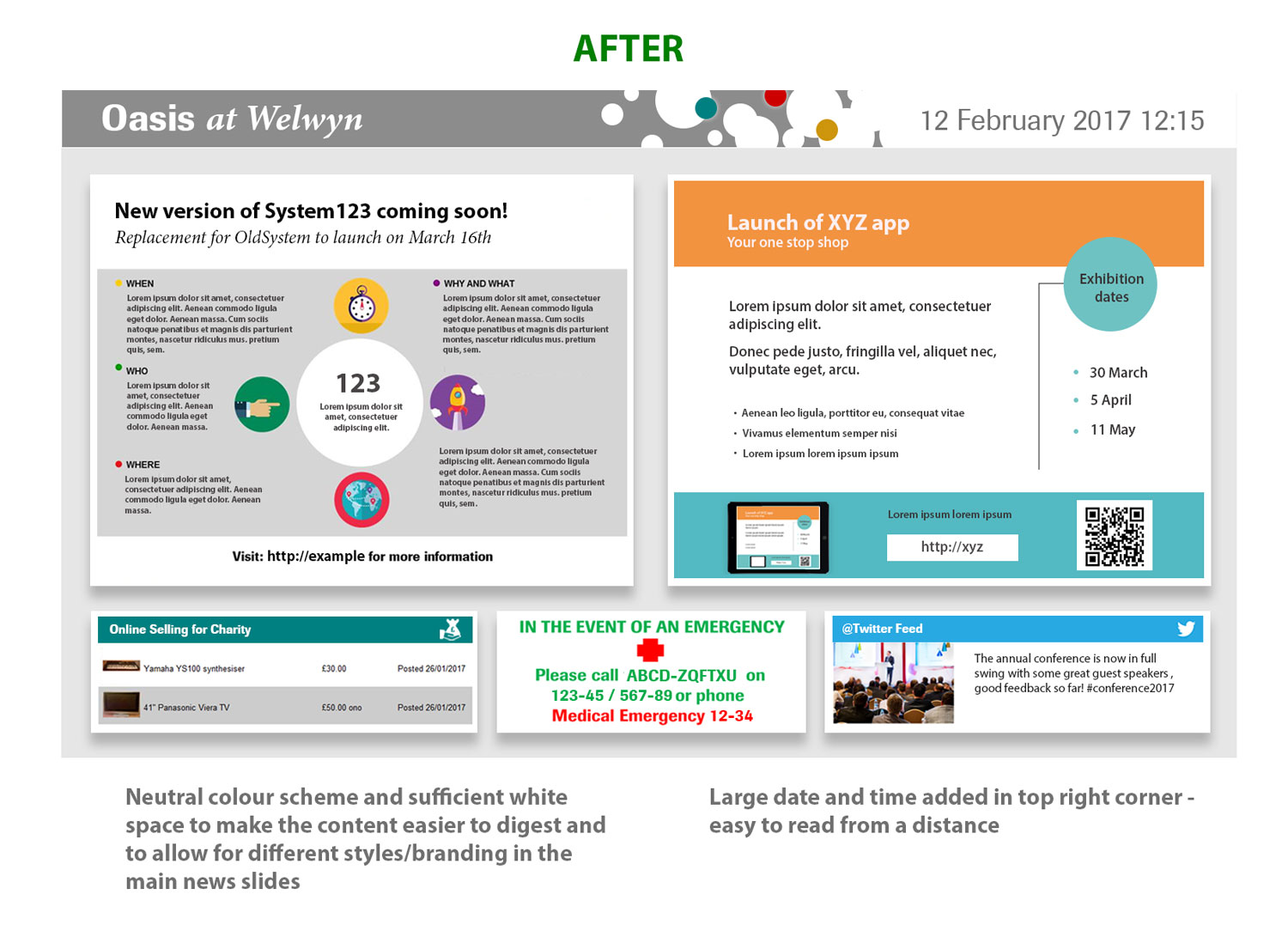
I drew a few sketches showing the possible layouts, before settling on this idea for the new design. This was loosely based on the old layout, but with larger news slides, more white space and a symmetrical design. I also included the date and time in the top right corner so that it was easier to read and could be seen from a distance.
Initially I included the weather section in my design but at the time my colleague was investigating the possibility of using a Twitter feed that had just been launched by the company. The Twitter feed was then approved by the stakeholders, and my colleague developed a Twitter API which could be used in the design instead.

Design
I designed a mockup of the new layout in Photoshop, and got feedback from the stakeholders. I included some of the colours used in the walls / seating of the coffee areas in a banner at the top of the display, while keeping it a neutral colour overall with plenty of space between each section to avoid it looking cluttered.
I then finalised the chosen design in Photoshop before configuring the screen layout using Omnivex Display Director.
Here is my final design:
Usability testing
I tested out the new displays with a few colleagues prior to the opening of the coffee areas. As a result I made some adjustments to the scrolling speed of the news slides so that people had enough time to read the information, but otherwise people could read the slides and see the date/time from a distance.
The Results
The new displays were successfully launched when the new coffee areas were opened. My new designs have helped solve the 3 issues I uncovered during the research – the content is now larger, clearer and easier to read, users can now see the time from a distance, and it is easier for the news slides to be updated.
Challenges
The biggest challenge I had was the news slides which usually came from different sources so the styles would often clash. This was something the business had no control over, so I designed a neutral background with sufficient white space around the slides to give a cleaner look.
Another challenge was to make it easier for the content managers to work with the news slides, as they often had to convert Powerpoint slides into images which were the wrong size for the news placeholders. In my new designs I ensured that the image placeholders matched the default Powerpoint slide size.
Client feedback
“Thank you so much for your proactiveness on asking about the new screens and then designing them to reflect the colours on each floor. This was an area that had been overlooked by the project team and without your helpfulness would not have been ready for when the new oasis areas were opening. Well done and thank you.”