


Project overview
Medical Detection Dogs is a charity that trains dogs to help people with life-threatening health conditions.
Their website provides information about their work and allows donations to be made online. I carried out a UX study on their website to find out what the usability issues were and to suggest some improvements.
I completed the case study during April-May 2017.
The Challenge
I was aware of Medical Detection Dogs as a charity, and after visiting their website I felt that it looked modern and fresh but I also felt that there could be some tweaks in order to make the donation process easier and more straightforward.
I worked on this UX case study in my spare time as I enjoy solving design problems and I am aware of the groundbreaking work that this charity does, so I wanted to help them in some way.
The Approach
Usability evaluation
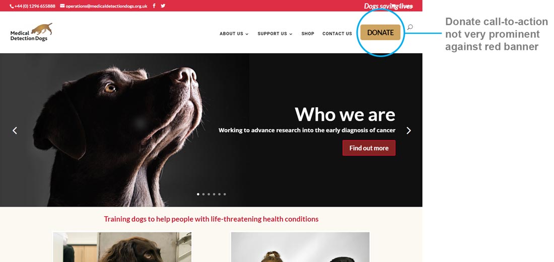
I decided to carry out a quick usability evaluation of the website first, to get an idea of the main areas for improvement. Initially I noticed that the ‘donate’ button wasn’t a very prominent colour, in contrast with the banner which was a bright red. There were also a lot of choices that the user had to make when deciding how to donate.
Customer research
Ideally I would have been able to do some initial research into actual customer data such as what people search for on the website, which pages they spend longest on, and how many instances there are of people abandoning the online donation process.
I didn’t have access to this data so instead I did some online research about people’s perceptions and comments/queries about the charity, and identified three key areas to focus my research on:
How can I apply for a dog?
This seemed to be a common topic, and also there were some Facebook posts online which suggested people weren’t aware of the eligibility aspect. There were also a couple of negative posts about being people being turned down when they applied. For this reason I wanted to find out if this information was easy for people to locate on the website.
Donate money
All charities have an objective to increase donations so I aimed to find out if people were struggling with the online donation process.
What do they do?
As this is an informational site about the charity, I wanted to find out if people could easily understand what the charity was about and how they relied solely on donations in order to train their dogs.
Usability Testing
Rather than base my new designs on my own assumptions, I decided to carry out some actual usability testing to see which areas of the site people struggled with.
Ideally I would have carried out this testing with people who were interested in applying for a dog, or who wanted to donate some money to the charity. As I didn’t have access to the charity’s customer base I chose four people who fit the profile of the majority of people who were commenting online.
Test Scenarios
I gave my participants some tasks to complete, which related to the three key areas of research highlighted earlier. I created the following usability test scenarios:
- You have diabetes and want to find out how to apply for a dog to help your blood sugar levels.
- You have just read an article about this charity’s work and want to donate some money online using your credit card.
- You have been told about the organisation by a friend and want to find out more about what they do.
Affinity mapping
I then reviewed my notes and wrote my observations for each user onto post-it notes. I then used the affinity mapping process to group together similar pain points into clusters, such as ‘donation form’.

Insights
The Affinity Mapping exercise provided the following insights into user behaviour and their pain points:
- Users get stuck when choosing between different ways to donate / support the charity
- Users take a long time selecting which way to donate (e.g., credit card vs. Just Giving)
- Users struggle with the donation form
- Users cannot find the ‘how to apply for a dog’ page
- Users on mobile devices did not easily find donate button and the donation form had some formatting issues
- Users had trouble with the menus or avoided navigating through them
- Users found limited information about the charity on the ‘About Us’ landing page
Analysis
In order to prioritise the pain points, I mapped them using a 2×2 matrix, to work out which of the pain points occurred most frequently, and which were important to both the user and the charity (based on my earlier research).

I decided to tackle the 3 issues which were both frequent and important, so these would be the ones I would focus on when planning my new designs.
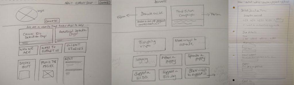
Sketches
I drew some new designs for the homepage, the donate/giving page, and the donation form. My aim was to cut down the number of steps and choices needed in order to make a donation.
Mockups
I then created mockups in Photoshop showing the current website ‘before’ and my design solutions ‘after’, with the the user flows highlighted.
Pain point 1: Users seem overwhelmed with different ways to donate / support the charity
Pain point 2: Users take a long time choosing between different donation methods (eg credit card vs just giving)
Design solution:
Combine the ‘Donate’ and ‘Giving’ pages into one to reduce the number of choices the user has to make, and simplify the Donate page to highlight the online donation options. Donating online is likely to be the most common way people want to donate if they are already on the website so it is important to prioritise this.
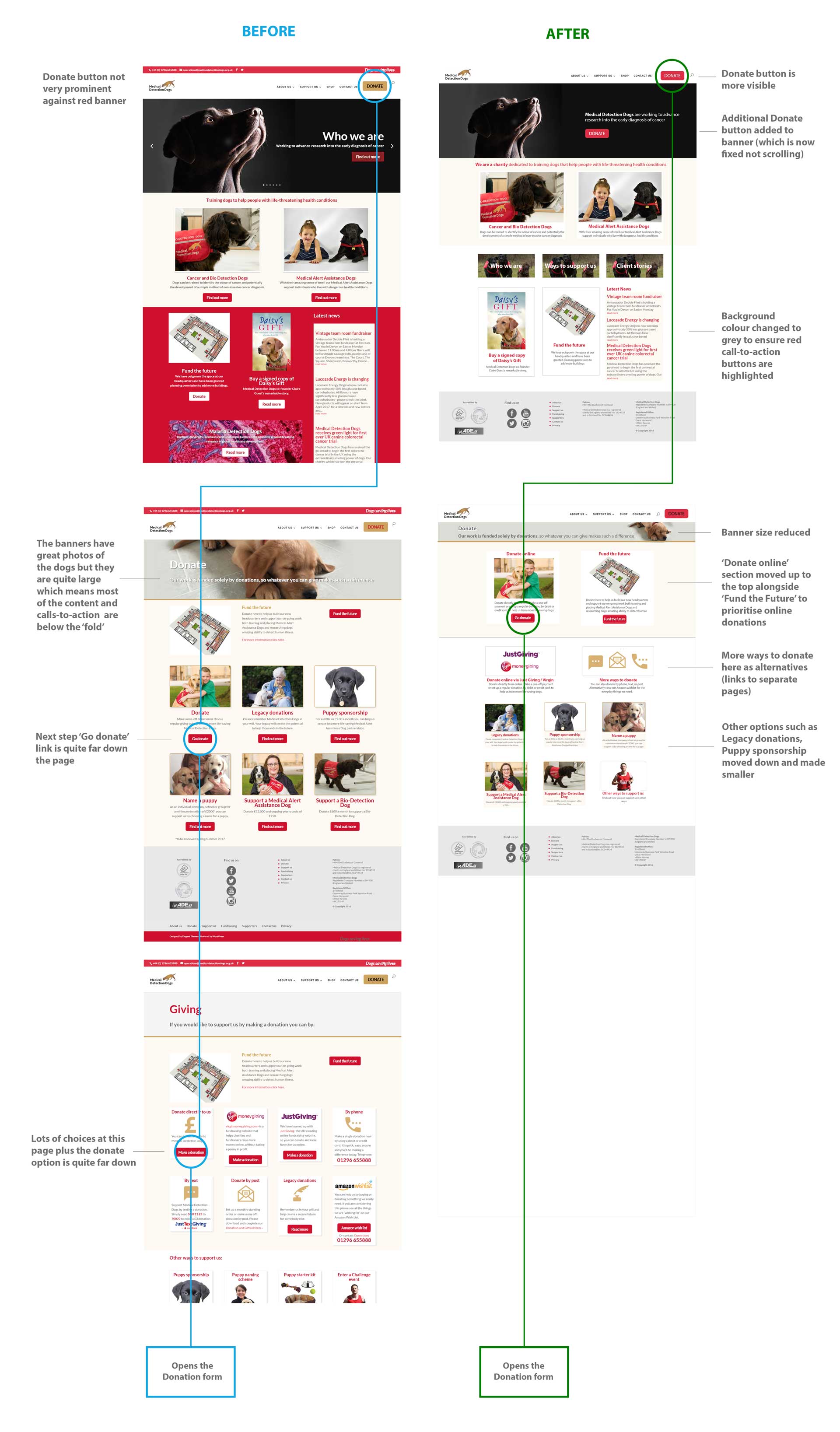
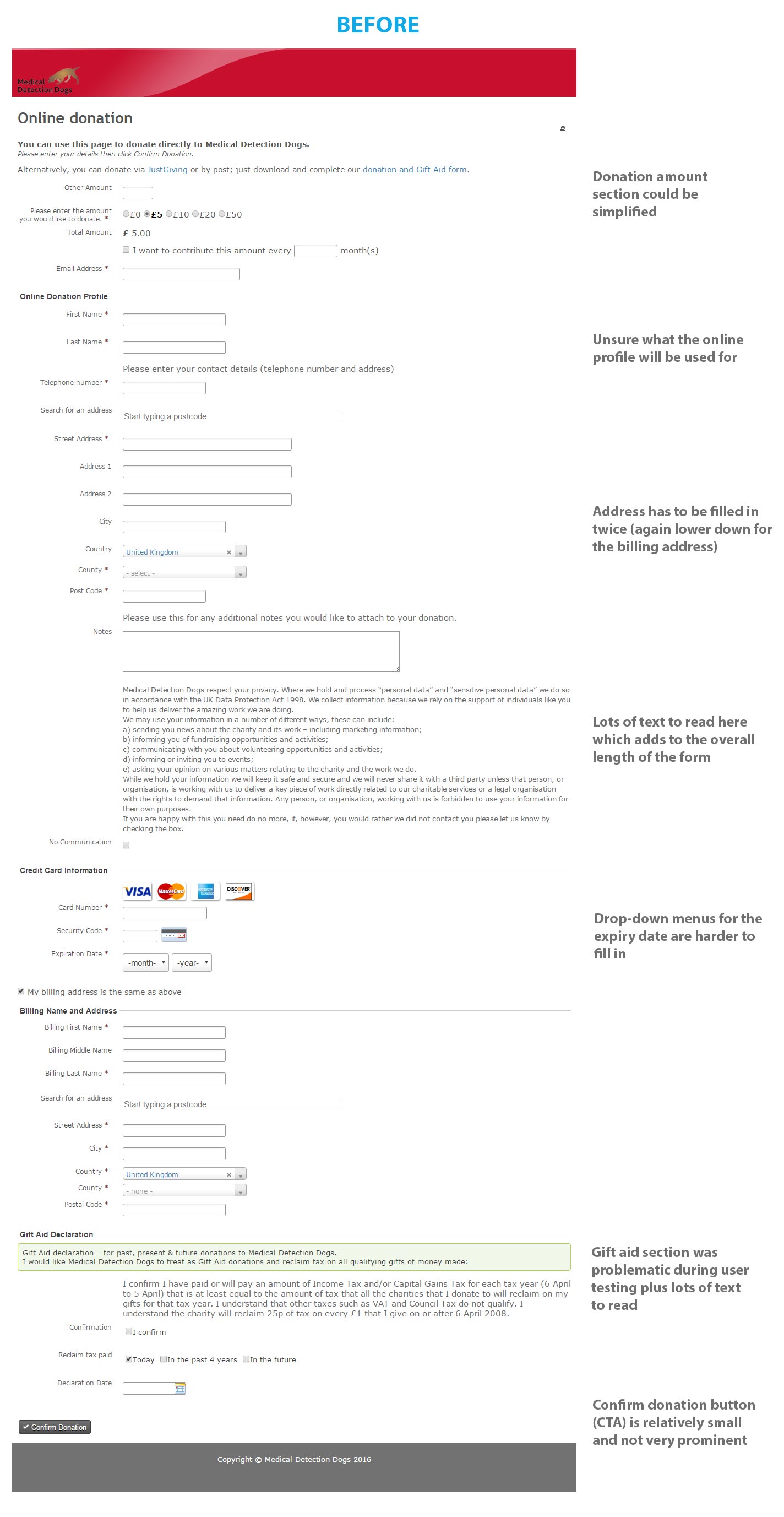
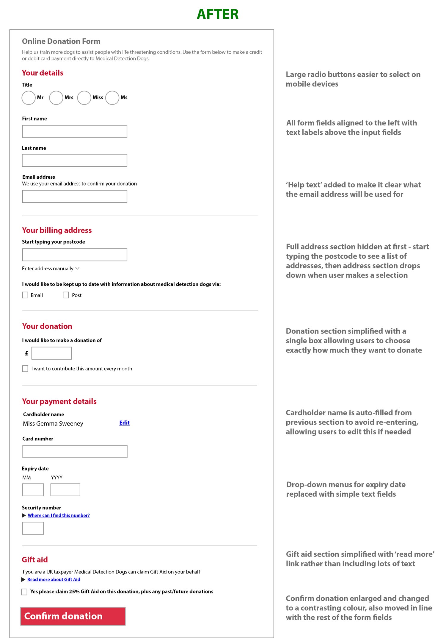
Pain point 3: Users struggle with the donation form
Design solution:
Simplify the form and divide into clear sections, left-align the input fields and enlarge the text labels. Also reduce the overall length of the form by removing unnecessary fields, and make the form easier to read and fill in on a mobile device.
Below is the current donation form:
These are my suggested design changes:
The Results
My design improvements have reduced the number of steps in the donation process from 4 to 3, and also reduced the number of fields in the donation form from 32 to 12. This makes the process of filling it in less daunting and more likely that users will complete it without being put off.
I believe these design changes I have suggested will improve the overall user experience and in particular streamline the donation process, which will hopefully lead to an increase in donations.
I intend to get in touch with Medical Detection Dogs to find out if I can help improve their website in any way. I’m hoping that these small changes will result in an increase in donations, which will in turn help more people with life-threatening conditions.