


Project overview
StreamReview is a social media site for sharing reviews of TV shows / films available on streaming sites such as Netflix.
The reviews are shared with friends on the site, so is a way of recommending shows you like and seeing what other people are watching.
My role is to carry out user research, design wireframes and run usability testing sessions. I am working with a developer who is creating the website.
This project was started in May 2017, and we are working on it in our spare time.
The Challenge
My friend who is a developer had a great idea to create a website where people can read reviews of films and TV series – in particular ones that their friends have added and want to recommend. Friends often talk to each other about what they are watching and ask for recommendations for new things to watch, and this seems to be focused on streaming platforms such as NowTV, Netflix, or Amazon Prime.
The website would be a way of bringing all of this together, including a social media aspect with the ability to see what friends are watching and then add your own comments and ratings.
My friend asked me to work with him on the UX design aspect which I was more than happy to do.
The Approach
Value proposition
My first task would be to think about the potential reasons that people would benefit from using the website.
- Getting recommendations – ideas of new films or TV series to watch
- Recommending films / TV series to friends
- Looking at what friends have recently watched / reviewed
- Adding ratings and detailed reviews for each film and TV series
I also tried to sum up the purpose of the site in one sentence, in order to help us when we got to the stage of promoting it and also to make it easier to communicate our idea to people.
I would later learn that this is similar to creating a value proposition, a promise of value to be delivered by your product. In this case the value proposition would be:
“StreamReview is a social network to share reviews of your favourite films and TV series on streaming platforms, and see what your friends are watching.”
Survey
I wanted to get a general feeling if the website was something people would buy into, so I decided to send out a survey to some friends and colleagues. The aim was to find out if people found their friends recommendations important as well as the general reviews. It was also a good opportunity to find out the main streaming platforms that people subscribed to.
I also wanted to identify which people watched a lot of films / TV series on these platforms (potential users of our website) so that I could interview them further.
Here is an example of one of the questions:
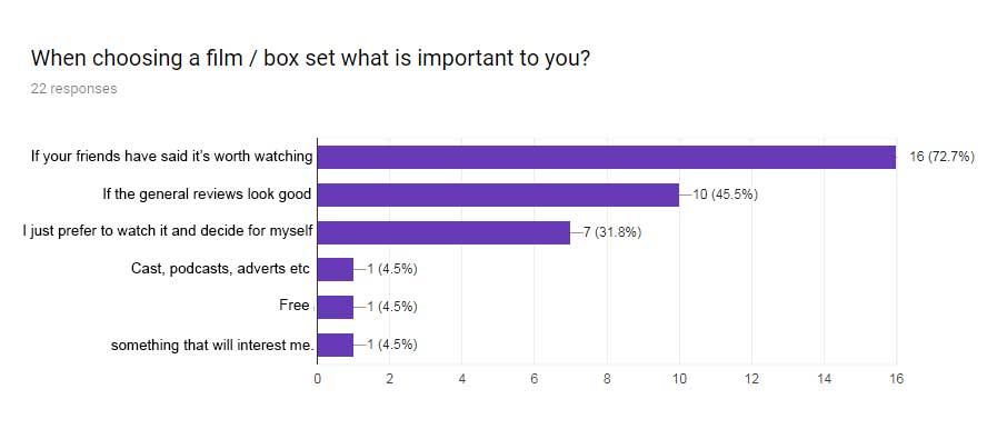
The survey results showed that the majority of people found their friends opinions important.
In particular the responses to these two questions showed that we were onto something:
How do you usually find out about new TV shows / films to watch? 69% selected ‘Asking friends for recommendations’.
When choosing a film / box set what is important to you? 72% of people selected ‘If your friends have said it’s worth watching’.
User interviews
I interviewed a few of the survey recipients, in particular the ones who said they watched a fair amount of films / TV series. My aim was to find out how they currently went about finding new things to watch. I also asked how they felt about the idea of the StreamReview website and if they would use it.
User 1: Watches a lot of films and TV series, often discusses with friends what they are enjoying, usually via WhatsApp. Would be drawn to the social aspect of the website, with the ability to comment and leave reviews.
User 2: Uses films and TV series as a form of escapism, talks to friends about great things they have watched and asks them for recommendations. Also looks for new film ideas in the media. Usually does this on their mobile device in the evenings. Likes the idea of the website and possibly a profile page where you can add your favourite films.
User 3: Scrolls endlessly on Netflix and feels there is too much choice, doesn’t trust the ratings (why does Pulp Fiction only have 4 stars?). Regularly asks friends what they are watching and saves recommendations in a list on their phone ‘stuff to watch’. Would use it, likes the idea of following friends with similar tastes in films to see what they recommend.
Findings: All 3 users regularly discussed what they are watching with friends, not necessarily in person but also WhatsApp, and actively went about finding new things to watch. They also liked the idea of the website and the social aspect to it.
User journey mapping
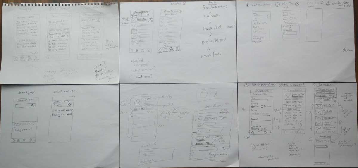
I sketched out some basic user journeys to reflect the main tasks that a user would need to complete, for example searching. These would then relate to the features we would need for the website.
We then worked out which of these features would be essential for our minimum viable product (MVP), and which would come in a later release (or not at all). This determined which screens needed to be designed first.
Here is my initial sketch:

We decided to include these features / screens for our first iteration:
- Browse and filter (homepage)
- Search
- Film / TV series ‘card’
- Add new review
- Add new title
User stories
I fleshed out these basic tasks into user stories, and we added them to a shared Trello board so we could track progress.
Example user story: “As a user, I want to be able to filter a list of films / TV series, so I can see the titles that have recently been added or reviewed.”
Sketches
I started sketching out ideas for the designs, here are some of the early ideas:
I used the mobile first approach as the website will be responsive, plus research showed that users would probably look at the site on their mobile devices. It is also the most challenging layout to design for.
Prototype
I created an interactive prototype using Sketch and Marvel, and tested it initially by running through the tasks myself, to ensure that the screens linked together in a logical way.
I ran through it with the developer and we agreed that the text needed to be made bigger. Apart from that the layout and flow worked ok.
We then decided to add a friends list and profile page, where friends could see the reviews you have added. These features related to our value proposition of “…seeing what your friends are watching” so we felt it was important to include them in the MVP, so that users could see the benefits of using the site. I designed screens for these features and added them to the prototype.
Here is the link to the StreamReview prototype:
Usability testing
I referred back to the user journey map and thought about the most important functions of the website, the user goals, and created usability test scenarios based on these.
- Open the app and browse a list of films and TV series.
- View a list of films only, that are top rated.
- You want to read more about ‘The Assignment’. Find ‘The Assignment’ and read the reviews that people have added.
- Find the Assignment and add your own review of the film.
- You want to look at the reviews for Breaking Bad. Search for Breaking Bad.
- You have searched for the film ‘Gravity’ and it’s not listed. You want to add this to the list of films, and add your review of it as well. Add ‘Gravity’ as a new title and add your review of it.
- You want to read the reviews that your friend Rob has added. Find Rob’s list of reviews.
I recruited 5 users to test with, and set up the prototype on my mobile device to best replicate how the website would be used, then asked each person to carry out these tasks while I observed and took notes.
Affinity mapping
I wrote my observations for each user onto post-it notes, and used the affinity mapping process to group together similar pain points into clusters.
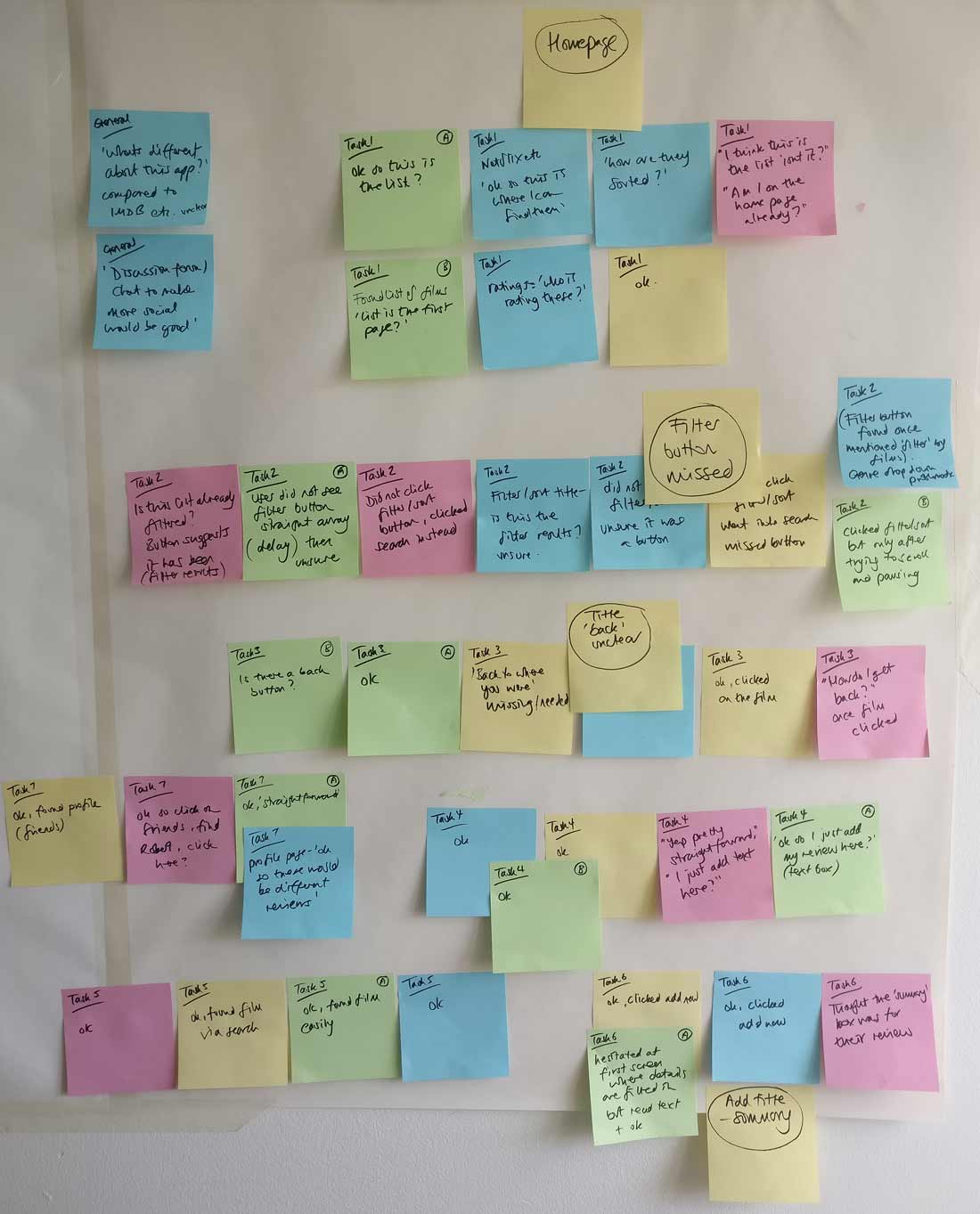
Insights
The usability testing and analysis provided the following insights:
Pain point 1: Users missed the ‘filter / sort button’ or did not realise it was a button
Pain point 2: Users were unsure if a filter had been applied or not
Pain point 3: Users did not know how to navigate back to the list of titles
Pain point 4: When adding a new title, user thought the title ‘summary’ field was for their review
Design iteration
I shared the usability testing results with the developer and we agreed which changes needed to be made to the prototype.
Pain point 1: I changed the filter / sort button so that it was more ‘button-like’ rather than looking like a heading/banner, and moved it to the right.
Pain point 2: I added an indication of the content that was being displayed, eg ‘All titles (38)’ at the top.
Pain point 3: I inserted a ‘back’ button to show that it was possible to go back to where you were in the list of titles after clicking on something.
Pain point 4: I added a line of text above the summary box ‘Summary: you can add your personal review on the next page’ to make it clear that the summary box was for the description of the film / TV series.
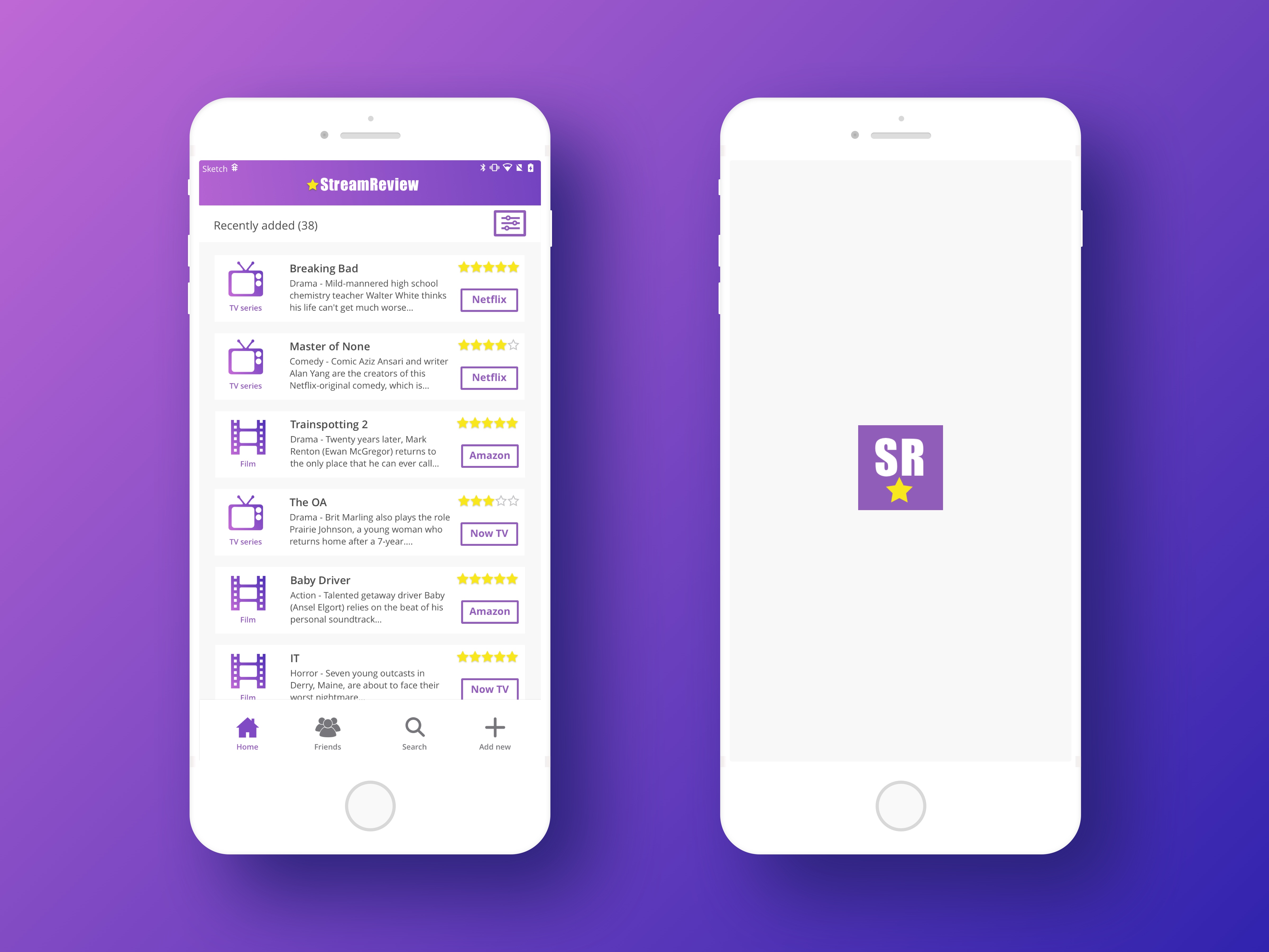
Visual design
While my friend started work on developing the site, I started to think more about the visual design. We had discussed using a dark UI with a ‘cinema’ feel as most people would use the website in the evenings, however this would reduce the readability of the text. The reviews on the site will need to be readable especially on a mobile device, so for accessibility we decided to go for a light background and dark text.
Here are my visual designs. The UI is still to be finalised, including the desktop layout, and will be implemented over the coming weeks.
The Results
The MVP has been built and is up and running, with working Facebook integration and around 40 titles have been added along with reviews. A number of our friends have logged in and carried out testing to find any bugs or issues.
The next stage will be to finish the visual design and carry out the next stage of usability testing with the MVP before making iterations as necessary.
Here is the link to the website: http://streamreview.co.uk
Challenges
Which rating system to use?
We discussed the different rating systems out there, and which would be best suited to our website.
We talked about using something quirky and different to make the site more exciting to use, which we thought would be fun but I felt it was important to use something that was universally recognised and easy to understand.
I did some competitive research and read a few articles which talked about the new thumbs up / down rating system that YouTube and Netflix had adopted. This allowed users to quickly rate content, but was very black and white and did not allow for a more creative rating/review which I felt that film fans would want to give.
After taking everything into account I recommended either using stars or a score out of 10. To make the ratings more visually engaging and easier to scan in a list of films, we decided to use stars.
Facebook integration or separate login?
We were unsure whether to prompt users to create an account in order to post reviews, or to integrate the login with Facebook.
Users tend to be put off by a separate account creation process, as it involves filling out a form – even if only a few details are needed. It would also involve remembering a password to log in.
To make use of the friends lists in Facebook and to make the login process easier, we decided on Facebook integration. We also saw an opportunity in the future to be able to post reviews to Facebook to tell your friends what you are watching, which would then drive engagement and lead new users to the site.
Note: Thanks to Anthony Boyd Graphics for the Isometric iPhoneX Mockup I used on the homepage: https://www.anthonyboyd.graphics/mockups/2017/isometric-iphone-x-mockup-vol-3/