


Project overview
Kompas is a internal website that guides users to the compliance related documentation (SOPs) they are required to read according to their role/department.
My role was to research and gather requirements before designing and building the site in MS Sharepoint. I worked with a developer in my team and the compliance department in Denmark to launch this project.
We created websites for both the UK and Denmark sites; this case study relates to the Danish version. I am writing about this particular case study because I managed the project end-to-end as well as designing and building the site so this is a better example of my work.
I completed the project during August-December 2015.
The Challenge
The compliance team in Denmark had already seen the website we had created in the UK, and were looking for a slightly adapted version.
Their current way of finding the correct documentation was not ideal so they were looking for a more robust solution. At the same time they wanted the subject of SOPs to be made more engaging with content such as news and videos.
The Approach
Kick off meeting
I held an initial kick off meeting with the compliance team in Denmark to discuss their requirements and find out how they were currently doing things.
I learned that every department/role in the business has a different set of SOPs (standard operating procedures) and elearning they have to read and understand, in order to remain compliant with local codes.
There was no easy way for a user to find out which documents they needed to read. The users had to find their list of documents in a shared spreadsheet, and then locate them in another system which was time consuming and prone to error.
Here is an example of the spreadsheet that was being used to track the required documents:
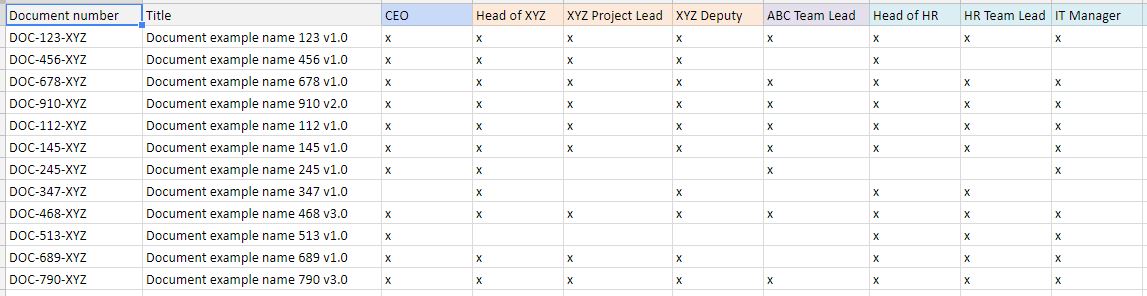
I also needed to find out specifics such as the number of documents to be uploaded to the site, examples of document titles, categories, and how long they had to be retained for. These factors would determine the design and setup as there were storage limits and retention periods in MS Sharepoint.
We agreed the project timescales and I created a project plan and set up regular meetings, in order to stay on track and discuss progress.
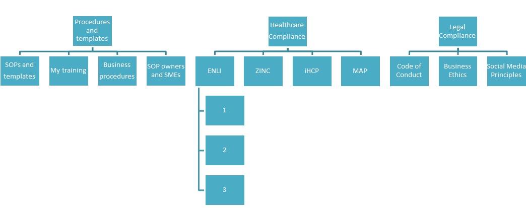
Site map
Based on the agreed contents of the site, I created a site map showing the potential structure and page names, and this was agreed by the compliance department.
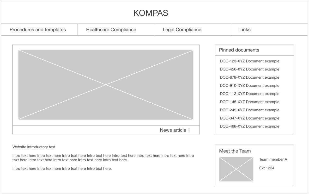
Mockup
Working from the site map, I created a mockup of the site pages in Photoshop including the visual elements of the design such as the logos and banner.
I included examples of content using the sample document titles I had been given earlier, to give a realistic view of how the site would look. I had also worked out the number of documents that would potentially be shown in each of the views and adapted the design accordingly.
I then arranged a meeting with the business to present the design and get feedback.
I can’t show any of the exact designs for confidentiality reasons, but I have since created a basic wireframe version of my design that I can show here.
The compliance team asked if they could have a separate page for each department’s SOP documents, instead of a single page. However this would have meant having a large number of options in the Procedures and templates menu (an extra 8 pages) and would make the site slower and more difficult to navigate.
I explained the reasons why it would be best to have a single page for this type of document, and that there would be an option to select the department and display the documents related to it. They were happy with this solution.
Prototype
At the time I didn’t have access to any prototyping tools, but since completing this project I have created a prototype in Adobe XD showing how the site functions. I have focused on the ‘Procedures and templates’ area in this model.
Building the site
Working with the developer had we found a way to customise the look and feel of the standard Sharepoint site templates that were used by the business. These templates were restricted at a global level, so the look and feel could not be changed using the standard menu options.
Using custom HTML/CSS, SharepointPlus and JQuery plug-ins we were able to customise the layout of the site pages. This made it possible to display data which was held in Sharepoint lists and libraries in a visually appealing way on the page. We were also able to add custom features such as a news carousel on the homepage.
The Sharepoint technology was not designed to work on a mobile device so I primarily designed for desktop and iPad.
The solution was designed so that the compliance team could easily manage the site content going forward. They could do this by uploading new documents to the site libraries without needing to edit pages or do any coding.
Usability testing
Once the site was complete and we had carried out some initial tests, I created a test script for the business which was focused on both usability testing and UAT signoff which was required as part of the project.
I sent the document over to the compliance team and advised that they run through it with at least 5 users. There were no major issues found, and the results of the usability testing were good – everyone was able to complete the tasks given:
- You want to see an overview of all the SOPs related to your role. Find a list of the SOPs you need to read.
- You need to refer back to a particular document. Find document XYZ.
- You need to see which elearning you need to complete. Find a list of your elearning.
- You want to see a list of all the procedures related to your department. Find your department’s procedures.
- You want to find a contact person for a particular SOP. Find the list of SMEs.
The Results
The KOMPAS website provided an accurate way for users to find which documents they had to read and understand as part of their role, which was a key benefit to the business from a compliance perspective. The cost of creating the site was effectively free to the business and saved money in 3rd party software development costs.
The compliance team have found the site easy to manage after it was handed over to them. We received great feedback for the site and it is still in use today (July 2017).
Challenges
One of the challenges was the fact that Danish was not my strong point, so when I received the text and headings that I needed to add to each page, I had no idea what they meant. I used Google translate to try and work out if the text would make sense in context, for example ‘select your department’ next to the dropdown menu.
The business also asked for a few small changes late in the development process, which I did my best to accommodate. To ensure that we launched on time I asked them to consider which changes which were the highest priority and would offer the most benefit to the users of the system, and suggested that we implement these ones only, which they agreed.
What I’d do differently next time
Ideally I would go to Denmark to do some initial usability testing with users, first using a paper prototype and then moving onto an electronic prototype to observe the users interacting with the website. I would then use the results from the testing to shape the design further.
However this would have been an expensive way to carry out testing as flights and hotels would have been involved, so another way would have been to use a remote usability testing tool such as User Zoom or even simple screen-sharing to run through some basic tasks with a prototype.
Client feedback
“Thank you very much for your fantastic service in developing Kompas in Denmark. You have demonstrated great technical skills and knowledge. We really appreciate your effort and contribution. It has been a pleasure to work together with you.”