


Project overview
Designing a series of financial calculators to help people be better with their money.
My role as a Junior UX Designer at Neyber involved research, design, prototyping and user testing. I worked with a Senior UX Designer, Product Strategist, UI Designer, Business Analyst and the Credit Risk department on this project.
Project duration: January – July 2018.
The Challenge
Design a series of conversational, easy-to-use financial calculators for the Neyber Financial Wellbeing Hub:
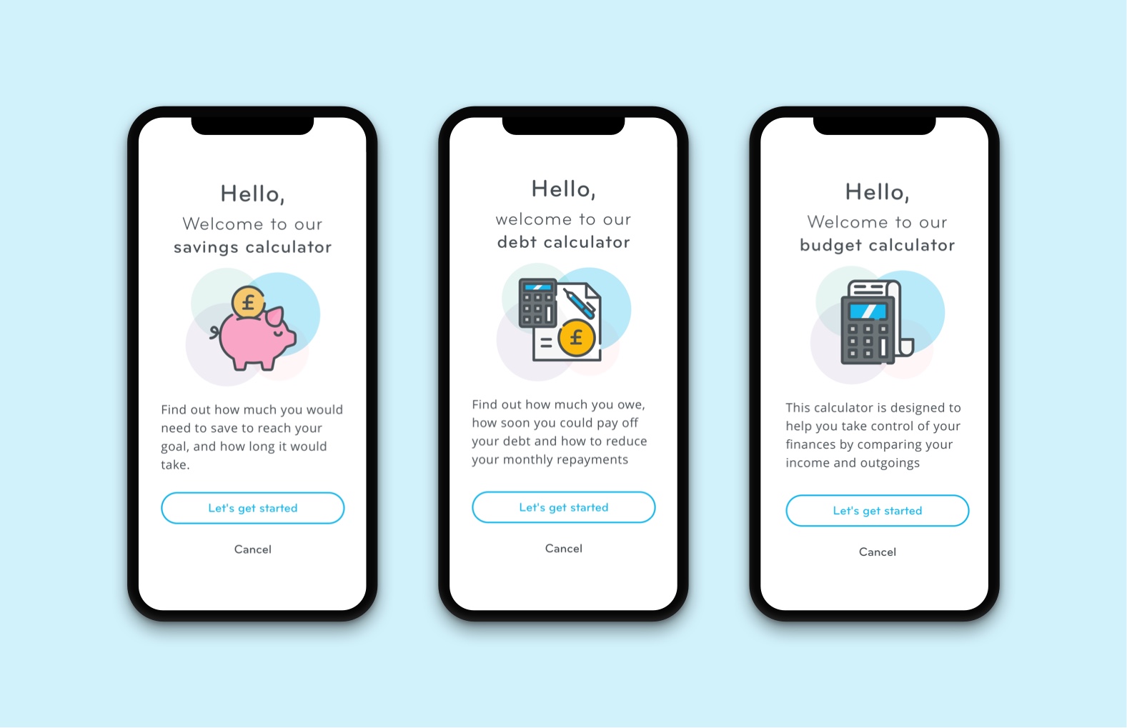
Budgeting calculator – to give users a new way to think about their budget – so that paying off debts and saving money is taken into account as part of a healthy budget.
Savings calculator – a personalised journey depending on user input, for example to work out how long it would take to save a certain amount.
Debt consolidation calculator – users can find out how much they could save with Neyber by consolidating multiple debts.
All of the calculators needed to be in a friendly conversational style, and be educational so that they provided tips and information along the way, rather than the ‘black box’ style calculators which assume a certain level of financial knowledge.
The Approach
Research
For the budgeting calculator I researched different budgeting methods, for example the 50/30/20 method which suggests that you should limit 50% of your budget to ‘needs’ such as housing, bills, food and transport, 30% to ‘wants’ such as meals out and going to the cinema, and 20% to savings.
I thought that this could be a good model to base the calculator on, and it could potentially compare how users budgets looked against this model.
I also carried out some competitive analysis, looking at other online calculators provided by various banks to see what worked well.
For our debt consolidation calculator, we needed to know average interest rates of loans and credit cards in the UK. I found out this information from the Bank of England’s database, so that we could base our calculations on these average figures.

Source: https://www.thebalance.com/the-50-30-20-rule-of-thumb-453922
Sketches
I started by drawing out the user flows for the savings calculator in a tree diagram, to help visualise the different paths a user would take depending on how they wanted to save – for example if they were saving with a target amount in mind, if they had a target date, or just wanted to save a certain amount per month.
I then started sketching the screen layouts for the calculators, working out the different steps in the process and thought more about the copy for the questions, keeping it conversational and friendly. I also thought about how we would capture the data and what sort of input fields would be needed.
Wireframes
I created some basic wireframes in Sketch, which I brought to life using elements from Neyber’s UI kit. I created both mobile and desktop versions.
It was at this point that I realised that if a page had multiple questions, the page could be quite long, especially on mobile. To solve this problem we decided to create Typeform-style interactions, so that the user could only see one question at a time.
Prototyping
I then created a clickable prototype using InVision which helped me demonstrate how the calculators would work, both to stakeholders and to the developers when discussing feasibility.
In-house User Testing
I used this prototype to carry out some in-house user testing with a few users, and made some adjustments to the designs following feedback.
UI Design
I worked with the UI Designer who helped ensure that the calculators had a consistent look and feel across all screens..
Development
I then worked with the Business Analyst and Development team to create the calculators. It was during this time that we looked at all the edge cases and found solutions, for example using different wording on the summary screen at the end depending on the users results and how healthy their budget was.
We had weekly sprint review meetings to talk about development progress, and during this time we could review any issues.
Guerilla User testing
Once the budgeting calculator had been developed we carried out a round of guerilla usability testing with members of the public, to ensure that any minor issues could be ironed out. We tested this on both mobile and desktop.
We in particular wanted to test the Typeform-style interactions, which wouldn’t have been possible with a prototype.
The Results
The budgeting calculator allows you to compare your income vs expenses but also looks at debts and savings. The objective was to provide a more holistic picture of budgeting, and the fact that it’s important to take into account paying off debts and putting money into savings as part of your overall budget.
The savings calculator gives a personalised journey depending on how you want to save, for example whether you have a target amount, or simply want to save a certain amount each month.
The debt consolidation calculator looks at your existing credit cards, loans, hire purchase and overdraft and shows how much interest you could end up paying on these over the overall term. It then shows what you could potentially save with Neyber if you chose to consolidate your debts with them.
This was a fun and challenging project to work on as a Junior, creating something from scratch and seeing it released was very rewarding and I’m proud of the work I did.
Challenges
A big challenge was creating the Typeform style interactions, as it was tricky to replicate the transitions between input fields, and the overall behaviour of the form. It was also impossible to replicate these interactions with a prototype, so the majority of our testing was done with a ‘static’ version.
Another challenge was to show the users budget in a visual way. It turned out to be difficult to design a data visualisation that would be understood by users, and would therefore add value rather than confuse them. It also needed to work well on a mobile device. We took the decision to create a simpler version without the data visualisation. This was also less time consuming to develop.